Almost anybody can build a PowerPoint—so, what differentiates an excellent presentation from a not-so-good one? Details can make all the difference. While your pitch may be perfect, your visuals may be undermining your message. Using these 5 tips can help you to create a more professional-looking presentation.
A consistent visual theme not only looks professional but can help convey your message by setting a tone. The template is a great place to start, but most of the templates included with PowerPoint are overused, boring, or downright ugly. If you are not working with a design agency to create a custom template, then you can make your own by starting with a blank slate. I recommend building a clean style with simple elements.
Excessive, unnecessary content and visuals that do not lead to better understanding can detract from your message. White space is good! It helps people to focus on your key points, making your visual message more powerful.
Here are a few simple rules:
- Use text sparingly, with only one point per slide and no more than 6 lines of text. Overly detailed information is more difficult for people to retain, and if they are reading the slide, they won’t be listening to you. Here’s more on why you should avoid too much text.
- Use sans serif system fonts such as Helvetica, Arial, or Calibri. These are easiest to read on-screen and will work on all computers.
- Make sure to keep headlines, subheads, and body copy styles consistent across your deck, using 2-3 styles max.
- Use color with purpose—to call out a key point, or to categorize information—not just for the sake of using color. You should have 1 or 2 primary colors and apply others as accents only—and, like font styles, these should be applied consistently.
- Limit animation. Slide after slide of animation will lose its effect and can bore the audience. Like color, use purposefully to help reinforce the message or illustrate a process.
Nothing can degrade your presentation faster than having dated, pixelated, or stretched photography and illustrations. Stay relevant—if your image displays outdated clothing and technology, what does that say about your product or service? The same goes for the quality and care of your visuals. Low-resolution or stretched imagery tells people you don’t care, and they may question the quality of what you’re offering. For more tips on using imagery, check out our post on how to choose the best stock image.

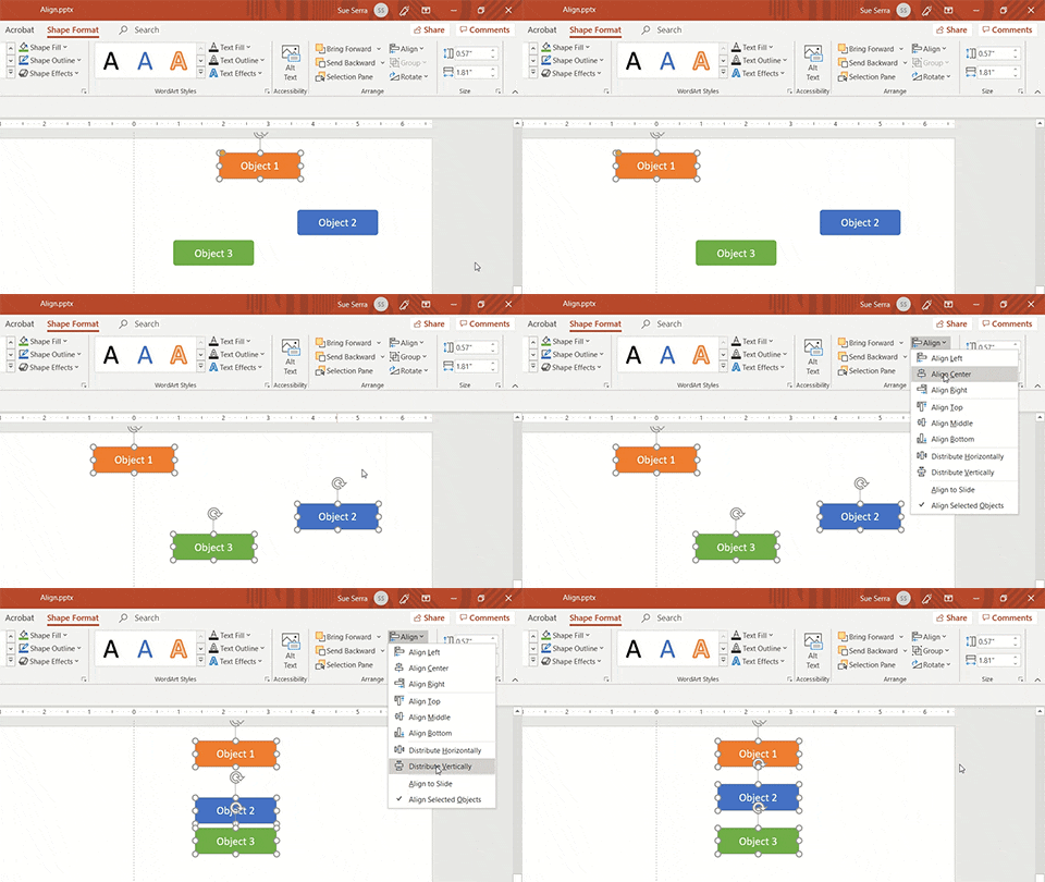
Align a single object to the slide or, with multiple objects selected, align with each other or distribute evenly
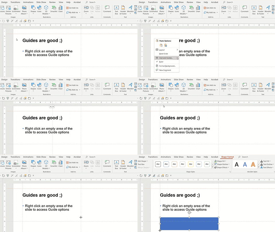
Grids and guides are your plan for where to place elements on your slide and have several significant benefits. They promote consistency in the layout across the presentation and bring order to a layout making it easier for the audience to digest information. Set up drawing guides to mark the intended position of margins and text placeholders—as you drag objects or anchors, they will automatically snap to those guides. To display drawing guides, you can right click an empty area of the slide (or in the margin around the slide), select Grid and Guides from the dropdown, and then check the box to Display drawing guides on screen. You can apply additional Snap options and Smart Guides depending on your desired level of control.

Set up Guides to “Snap” your objects into position
Remember, it’s the little things that can make you stand out, so don’t forget the details.
Now that you have a well-designed presentation check out our tips on how to present like a pro.


